About Woolly Wits

I am a hand-knitting designer and teacher. See and purchase my published designs on Ravelry.

Tuesday, November 19, 2013

Woolly-Wits Reviews Interweave Knits Winter 2014


This Winter 2014 issue of Interweave Knits is the first for which the new editor, Lisa Shroyer, owned the entire process, from submitting the call for designs, to project selection, to photography, to layout, and all the way to publication.  And, it shows.  As a collection, I think this is the most wearable I've seen from IK for a very long time.  Of course, it still have too many crew neck pullovers for my taste, but at least the ones presented are modern interpretations of classic knits.  And, the skinny girls need sweater options, too.

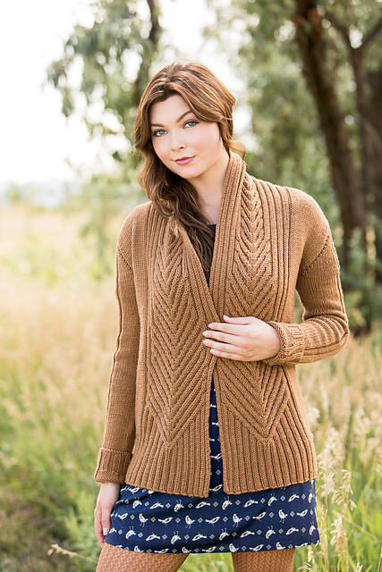
I am going to begin with what I think is the standout of the issue, L'Acadie Cardigan designed by Bristol Ivy.  To me, this should have been the cover design.  I suspect that it is not because the color is underwhelming.  (The orange Henley on the cover is much more eye-catching.)  

I love how the design gets more interesting the longer you look at it.  The chevron rib pattern is actually cabled down the center.  And, it narrows as it moves up to the shoulder, with increasing numbers of vertical ribs as the transition to the stockinette stitch.  The combination of vertical and diagonal lines, as well as the very strong vertical line created by the center front opening.  While there is a lot of texture, and a larger stitch gauge, that is balanced by the stockinette stitch background.  

What doesn't thrill me is the modified drop sleeve.  It is creating a line which cuts across the upper arm.  This is not a design detail for those of us with chubby upper arms.  My solution would be to substitute a set-in sleeve, as this would not appear to impact the stitch patterning.  (Of course I could never knit a sweater pattern as written . . . .)


The State Fair Cardigan by Heather Zoppetti (shown in purple at right) is another highly textured cardigan.  The cable are in very high relief, so this is one to be careful of if you are large busted.  But, as in the L'Acadie Cardigan, it has very strong vertical lines accented with the diagonal lines of the stitch pattern.


Another design with strong verticals and interesting stitch patterning is the Cerrito Caridgan by Faine Goberstein (shown in beige at left).  It's a combination of the vertical cable and diagonal herringbone stitches.  The longer length is good for camouflaging wider hips and thighs.  


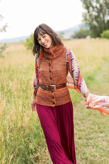
Cynthia's Cardigan by Andrea Sanchez (shown at right in variegated orange) is a good design for ladies who carry their weight through the hips and thighs because the volume of the collar provides a visual balance.  (But don't wear this sweater with the collar buttoned up unless you have the long neck of the model.  On a shorter neck the  collar will appear to swallow your head!)  When worn open, the collar creates a strong shoulder line, which also provides balance.  The dk weight gauge is not so bulky as to add visual weight.  

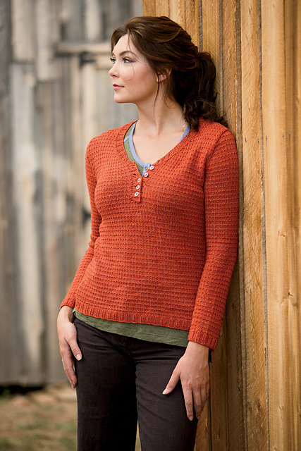
This issue also features two Henley designs.  A Henley has a center front opening that provides a nice vertical element, but it stops mid-chest.  This means that it doesn't have a full vertical impact of a cardigan, and it is harder to get on and off since it's still a pullover.  But, they are an interesting variation to the wardrobe.  Of the two, I prefer the Manicouagan Pullover by Alex Capshaw-Taylor (shown in gray) because it has a longer Henley opening, and it also has vertical stitch patterning.  But, if it were me, I'd just extend the placket and make it a true cardigan.

Overall, I would say that this is an outstanding issue of IK, and I am looking forward to seeing more of what Lisa's leaderships brings to knitting.  

Friday, November 15, 2013

Stiall Hat & The Jogless Join

My free pattern, Stiall, is a simple striped hat.  But, there is a trick to knitting a better stripe in a garment knit in the round - the jogless join.

When working a pattern in the round, it will be interrupted and take a stair step up at the beginning of every round.  In a pattern as graphic as a stripe, this can be seriously distracting.  There are a few methods to smooth out this transition between colors, and I am passing along my favorite tip here.

When it's time to change colors, just begin with the new color.  All the fuss occurs at the end of that first row of color change.  When you return to the beginning of the round, with the left needle pick up the first stitch of the round below (it'll be the old color), and knit it together with the stitch from the current round.


This is something many knitters know, but the real hint is that you then need to move your marker which indicates the beginning of the round to right after this 2-row stitch.  Yes, you will be moving the beginning of your round over by one stitch with every color transition, but for a simple pattern like these stripes it will not make any difference.  Of course, if you are working a pattern that need to align vertically this doesn't work so well.

So, how does this look?  On the inside you'll have a line with your carried yarn running diagonally across the surface.  And on the outside?  Well, it depends.  On my darker version, you can barely see it.  But on the lighter version, it does not disappear into the surface.  I still think it looks better than the interrupted pattern I would have had without the jogless join, so I am sticking with it.  

Wednesday, November 13, 2013

Gait's Haire Cowl & Wrap


The week before VK Live! Chicago was crazy.  I posted three new patterns that week!  Two are for sale on Ravelry, and the third is my free striped hat pattern available here, Stiall.  One of these patterns made a splash at VK - the Gait's Haire Cowl & Wrap.

If you check out my designer page on Ravelry, you'll see that I've had several published designs using different techniques to create a classic woven fabric, plaid, from a knit fabric.  I enjoy it because I love working with color, and the geometry of the plaid is very graphic and modern.  

Somewhere my designer's brain came up with the idea of working the plaid in a lace weight mohair and silk blend yarn.  (That place was probably my shower, since that I have more brainstorms there per square foot than any other location in my home.)  I love the virtual weightlessness of the fabric, especially in contrast to the heavy fabric it would be in a woven wool plaid.  And, I love how the two colors of yarn blend so beautifully in their mohair halos.  Apparently a few knitters agreed with me, because the hard copy patterns were sold out shortly after noon on Saturday.  


Be warned!  This is not a beginner, or even an intermediate level pattern.  Mohair yarns are challenging to work with, and in this pattern we've got multiple strands of them.  Whether you use bobbins or (like me) play dangerously and work with short lengths that tangle relentlessly, you need patience.  But, the pattern is a simple repeat which is easy to memorize.  And, the results are amazing.


Interested in a scarf rather than a wrap?  Just follow the directions for the wrap but only work two repeats of the pattern.

I am still so enchanted with the concept that I am continuing to play, and am working on a four color design.  Watch for that.

Oh, and why Gait's Haire?  According to my on-line Gaelic dictionary, a 'gait' is a goat.  So, the name literally refers to the primary fiber - goat's hair.  (I added the 'e' at the end for romantic embellishment.)  But, in a clever twist brought to my attention by the aforementioned internet dictionary, the term also describes a type of fluffy cloud.  Since this so aptly describes the finished accessory, the name couldn't be more perfect.  

(The wrap and purple/butterscotch/gold cowl are knit in Shibui's Silk Cloud.  The green/cream/red cowl is in Rowan Kidsilk Haze.)

Wednesday, November 6, 2013

Quick Round: Which Sweater Is Most Flattering?

Not dragging this battle out to three rounds . . . three pics of the same model in three different sweaters featured in the fall 2013 Webs catalog:


On the left is the Basic Crochet Pullover designed by Liz Alsop.  In the middle is Monarda Pullover designed  and knit by Annie Foley, and on the right is the knitted Papyrus Cardigan designed by Kirsten Hipsky.  So, which sweater do you think is most flattering?

I think we can pretty quickly eliminate the blue crochet pullover.  Although it has a nice v-neck, it also has horizontal striping going across a sweater with no side shaping to enhance the figure.  There's also a lot of excess fabric in the underarm (see the wrinkles?) which adds visual weight.

That leaves the yoke-patterned pullover and v-neck cardi.  Most of the time, I would immediately go for the cardi, but this one has horizontal stripes.  I do think the pullover is cute, and it works on the model because of her thin torso and upper arms.  It would look a lot better if the t-shirt underneath were closer in tone to the brown.  And, I think the pullover is skewing a little young for the model.

So, which garment wins?  I am going to give it to the pullover, as long as she puts on an earth-toned turtleneck.

Tuesday, November 5, 2013

Woolly-Wits Reviews Vogue Knitting Holiday 2013, Part II


After rhapsodizing in my last post over how much I (almost) love Shiri Mor's hourglass cardigan in my last post, today I am taking a different twist and chatting about horizontal design lines.  If you've ever been to this blog before, you are likely aware that I am violently opposed to horizontal lines in garments.  The reason why is that they cause your eyes to move across the body, and that visually widens you.  And, who wants to look wider than they are?  Well . .  . . there is a body type that can benefit from a well-place horizontal line.  


I am reminded of the virtue of horizontals by my friend Mary, who has been my partner in giving 'What Not to Knit' talks at our LYS and local guilds.  Her body type is just about as opposite of mine as could be - narrow shoulders, smaller bust & chest, no waist, no booty and broader through the hips and thighs.  (I don't think that I have lost her friendship forever by revealing this information.  We're both pretty upfront about how our bodies deviate from the 'average'.)  Mary loves horizontally striped sweaters because by visually widening her upper torso, her wider hips are brought into balance.  The trick is to do the horizontals the right way.  And, there are a few sweaters in this issue of VK that do just that.


The first is Laura Zukaite's sparkly and sheer party pullover.  The striped combination of sheer and denser lacy stripes ends just where it should - well above the waist.  This keeps the focus on the upper torso and away from the hips.  The slash at center front makes for a strong vertical design element, as do the more subtle stripes of the ribbing.  The only thing I would tweak about this design is to shorten the hem to a high hip length, since you never want to have a horizontal hem line fall at your widest dimension.


The other design that I think makes good use of horizontals is Robin Melanson's cabled cardi.  One of Mary's biggest complaints is about sweaters that want to slide off her shoulders.  Not this one!  The three buttons at the neckband and upper chest, along with the wide collar and stripes create a very strong shoulder line to balance width below.  At the same time, the striped front bands create a strong vertical line, and the cables a more subtle vertical.  What might I tweak here?  For a fuller busted figure, I would add two more buttons to prevent gaping.  And, for a prominent tummy, I would add buttons all the way down for the same reason.  


So, what makes these two designs examples of successful use of horizontals?  They introduce a vertical design element into horizontal fabric patterning.  They also stop well short of the hips (or would after my suggest tweak).  And if I know Mary, she's got some beautiful Noro yarn in her stash to cast on Robin's cabled cardi right away.

Friday, November 1, 2013

Woolly-Wits Reviews Vogue Knitting Holiday 2013, Part I


Vkh13_sheersolid_03_small2

I had to break my review of Vogue Knitting's Holiday 2013 issue into two posts because I want to spend a whole post talking about what just narrowly misses being one of my favorite designs of all time:  Shiri Mor's geometric hourglass cardigan.  The VK staff must have recognized it's greatness, because they gave the design two full page photos.  (Of course, I would have preferred one of the nearly identical photos to be a back view, but that's what VK360 is for.)  

This design has so much of what makes a figure flattering sweater:  fitted shape, vertical design elements, diagonal design elements, and a cardigan style.  I love the sheerness, and the fact that it is shown in one of my favorite colors.  
Modular_top_back_small2
But it also has the geometry that I've always loved in Norah Gaughan's designs.  The design consists of hexagons which form the sides and wrap to the center front and back.  The remaining spaces are filled in with triangles, except, of course, for the sleeves. All the pieces are connected by bands of crochet done in a heavier weight yarn for contrast.  The hexagons meet to form an hourglass shape, which is not only very on-trend, but super flattering.  My hourglass variation appeared earlier this year in the Spring/Summer edition of Noro magazine.  


Noross13_11d_small2
So, what's not to love about Shiri's design?  The pattern isn't written for my size.  In fact, it's not written for anyone with a chest size larger than 40", which includes the majority of American women.  In Shiri's defense, and by that I really mean the VK tech editors who grade patterns up and down from the original sample, as designed, the sweater does not lend itself to proper fitting of larger sizes.  Let's take a closer look at the placement diagram.  
The shaded shape in the diagram, #9, is the armhole opening.  Since I have wrangled a few knitting and sewing patterns in my day, I can tell you that a diamond shape is not the natural shape formed where your arm meets your torso.  It's much more of an oval with a flat bottom.  Skinny people can get away with this sort of insanity because there isn't much fabric there to begin with.  But, in larger sizes, and especially for those of us with chubby arms, and this armhole shape becomes very uncomfortable.  

(I have to add here that this is where many top-down designs go wrong.  I've seen too many top-down patterns that don't cast on additional stitches when they split for the armholes.  What happens then is you end up with the unnatural pointed shape here.)

The other argument against adding larger sizes is that to add circumference, the size of the hexagons has to grow.  At some point that geometry no longer works, but I would suggest that it actually would improve the fit for a few sizes past 40".  If the hexagon were taller, it would be closer to the armpit.  If you then eliminated the #8 triangles, you'd have a triangle-shaped armhole which would be closer to human anatomy.  If necessary, you could make some tiny #8s to fill the corners, but I think the flexibility of knitted fabric would fill in the shape nicely.  

While I am re-designing this beautiful sweater, I would personally also square off the upper body triangles to turn the drop shoulder into a set-in sleeve.  A lot of pattern adjustment would be involved (so I'll leave that discussion for another time), but it would, again, be a big improvement in fit, especially in larger sizes.

As I sum up everything I would change about this sweater that I love, I am perhaps reminded of why I knit more skirts than sweaters.  Skirts have only three crucial fit points:  waist, hip and length.  There are so many more fit points and issues in a sweater that need to be addressed before I'll invest huge amounts of my time.  I want to love what I knit, and the only way to achieve that is to choose patterns that will flatter and adjust fit to your figure.