About Woolly Wits

I am a hand-knitting designer and teacher. See and purchase my published designs on Ravelry.

Friday, September 27, 2013

Round #2: Cardi vs. Henley

Today going head-to-head we have a v-neck cardigan and a scoop neck Henley sweater:

Both of these sweaters are worked at the same gauge, 18 stitches over 4".  I generally prefer to use a lighter weight yarn for sweaters, because the thicker the yarn, the thicker the body underneath appears to be.  The brown sweater is 100% wool, while the gray is 48% cotton, 46% modal and 6% silk.  If you look at the bottom of the sleeve, I think it's apparent how much more drape the gray sweater has.  Generally that is a good thing, because draped fabric will tend to reveal more of the body underneath and have a slimmer line.

However . . . more prominent here for me are the design lines.  The brown cardi had dramatic buttons which continue the strong vertical line begun at the v-neck.  The gray pullover has a cute little vertical line of buttons, but the vast majority of the body of the sweater is boring expanse of stockinette stitch.

So the winner is:  brown cardi!

Thursday, September 26, 2013

Round #1: High Neck Pullovers

 In the face-off for Round #1 of our Battle Rounds, we've got two pullovers:

If you've visited my blog before, you might have surmised that I have no love for either crew or boat necklines.  Both cut off the vertical line created by the head and neck.  And, they square off the shape of the sweater and make the body look boxy.  So, I fully expect the winner of this round to fall pretty quickly in our tournament.

Another design element I feel strongly against is horizontal lines.  They force the eyes to move back and forth, which makes the wearer appear wider.  Looking wider is something which I am accomplishing very well on my own, so I don't need any help from my hand knits.  Both these garments have horizontal lines - very obviously in the striped sweater, but definitely present also in the lines where the patterns change in the green sweater.

Another issue I have with both is the upper sleeve.  Like myself, the model is blessed with beefy arms.  In both garments, there is inadequate ease so that the fabric is stretching over and drawing attention to the width of her upper arm.  In our own sweaters we can avoid this by comparing our arm dimensions to the pattern schematic and, if needed, working a larger upper sleeve and armhole.

So, if it wasn't already clear, I don't think that either sweater is doing any kind of favor to this lovely girl.  So which way is the judge leaning?  I am going with the striped sweater.  The raglan sleeve is far more flattering than the dropped sleeve of the green sweater.

Round #2 tomorrow.

Wednesday, September 25, 2013

Battle Rounds: Which Sweater is More Flattering?

In honor of the new season of The Voice on NBC, I bring you my own battle rounds.  One on one, winner takes all.  Which sweater is the most flattering?


You've met the contestants.  Six different sweaters, all modeled in the same setting by the same very lovely, very real young woman, and all from the Summer 2013 Valley Yarns catalog.  Valley Yarns is the house brand yarn from Webs, to my mind the most comprehensive yarn shop on the web.  (And, I am not a supporter just because they are located in my college town, Northampton, Massachusetts, because Webs was actually across the river over in Amherst in my fiendish knitting days.)

Starting tomorrow, we'll pair off the sweaters and let them go head to head in my analysis of their ability to flatter this body.  

So, tune in tomorrow . . . 


Wednesday, September 18, 2013

Wooly-Wits Reviews Interweave Crochet Fall 2013

OK, while I can't promise equal time to hookers, I can give them some time - my review of Interweave Crochet Fall 2013.      

This is the cover design, Better Than His Sweater by Amy Gunderson, and it fabulously follows the rules for figure flattery.  (Just a little alliteration!)  The shawl collar and button band create strong vertical lines, as does the vertical patterning of the wiggly lines.  The fit is snug to show off her form, while still appropriate for an outerwear garment.  And, the length is great, too - just long enough to fully cover her bottom.  


The only complaint I have, and it's not a big one, is the placement of the crossing vertical lines.  As you can most clearly see on the back view, the point at which they cross is a few inches below the model's waist.  I would move them up to match my actual waist, where they would give the illusion of a more trim waist.


Crocheted SkirtI love a skirt - knit or crochet, and the Asquint Skirt by Annie Modesitt is a beautiful design.  The flared A-line shape is universally flattering.  The placement of the stripes is also key to the flattery.  Any higher and they would draw attention to the width of the hips and thighs.  But, placed near the knee, their visual weight balances those broader areas.


I almost missed the subtle stripes in the upper portion of the skirt.  I am not convinced they are necessary.  You wouldn't want them to be any more contrasting, but they are so close in tone that I wonder if they are worth the effort.  They do make better use of your yarn, since that green color is hardly used in the dramatic stripe patterning.

The yarn used is Brown Sheep Wildfoote Luxury Sock, which is a great choice. A skirt done in all wool will have a tendency to 'seat out'.  That means that when you stand up, your skirt back will retain the unattractive bubble shape of your seated bottom.  That's because of the lovely memory wool fiber has when acted upon by tension and body heat.  But, add in a little bit of nylon, which has no such memory, and the wool springs back to the same shape that came off the needles.  So, sock yarn or any other wool yarn with nylon is a favorite of mine for working skirts.

There are also some lovely accessories in this issue, so it is well worth checking out.  For a quick peek without a trip to the yarn shop or bookstore, search for the issue on Ravelry:  http://www.ravelry.com/patterns/sources/interweave-crochet-fall-2013.


Monday, September 16, 2013

Up-Cycled Cashmere Yarn, Part II


Yesterday I told you about my fabulous garage sale find - a cashmere sweater done in a hand-knitting weight yarn.  And, I told you that it's a pretty rare sight, as most cashmere sweaters are machine knit with super fine yarn.  So, when I see one, I snatch it up.  I figure it's worth a little of my time and effort to make my own cashmere yarn.
 The first step is washing.  Honestly, it was purchased at a garage sale!  If fuzz it going to be flying, I want to to be clean fuzz.

After a bath and a dry, I rip out the seams.  I use a chunky seam ripper, and make no effort to save the seaming yarn.  In the case of this sweater, the yarn used to sew it together was much thinner and not 100% cashmere.  That's not surprising, since cashmere isn't strong.  You do need to be careful to snip only the seams, but I did cut the body yarn - twice.
 Most machine knit sweaters are constructed the same way hand knits are - bottom up.  So, start looking for a loose end at the shoulder.  Chances are you worked it loose as you were ripping out the shoulder seam.  Once I've got it, I lead it in to my ball winder to speed up the frogging.  One hand on the handle, one holding down the sweater piece.  The yarn will snag at the edges, since it is turning back on itself, so be prepared to frequently stop and work that loose.

When I was done, I had two balls of worsted weight cashmere yarn.  131 grams to be exact.  And what's the price of that on the open market?  Jade Sapphire Brigadoon is a worsted weight 4-ply cashmere that sells at Webs for $47 for a 50 g ball.  (And I think that's pretty cheap!)  At that price, my two balls are worth $123.  Not bad for a $3 garage sale sweater purchase and less than two hours of my time.  (And most of that was in front of the TV!)

Obviously, I haven't knit this up yet, but here's a photo of my design, Double-Dealing, a reversible cabled scarf, done in pale blue yarn up-cycled from a thrift store sweater:

The scarf pattern is available for sale as an electronic download on Ravelry.

Sunday, September 15, 2013

Up-Cycled Cashmere Yarn, Part I

A girl does not live by sweater design critique alone, so now for something completely different . . . .

My friend, Melissa, and I get our girl-time together on Saturday mornings when we scour garage sales in better Chicago weather and estate sales in worse.  Yesterday morning I pulled this off a rack (which was really a wooden rod suspended between two ladders).
 What's so interesting about this sweater?  Take a closer look at the tag below . . .

Yep, it's cashmere.

Now, I live in an upscale neighborhood (although on a more downscale block), so sighting a cashmere sweater in such an unnatural habitat as a garage sale is not uncommon.  What is unusual is finding a sweater that is hand-knitting weight.  You can see the individual stitches, even in the photo of the full garment.

 To be honest, I spend a lot of time not only at garage sales, but also at thrift stores.  My children are involved in musical theater, and I volunteer doing costume design and creation.  It is always cheaper to start with fabric from a thrift store than to buy new yardage, not to mention saving time.  So, for a few pre-production months every year, I haunt them.  And, I never leave a thrift store without cruising down the sweater aisle.  I've trained my eyes to spot that familiar haze of a cashmere knit, and I would boast that not many escape my notice.  But, out of the hundred cashmere sweaters I've spotted in the past few years, only a handful have yarn thicker than dental floss.  So when I see them, I grab them.  Why?

Tomorrow I'll tell how I go from the first photo to the last and how much I paid for the sweater.


Wednesday, September 11, 2013

Seduction


For a couple months now I've been following Karen Templar's blog, Fringe Association.  I enjoy it because it's like being able to sit at the cafeteria lunch table with the cool kids.  Karen is ahead of the curve on trends, and I appreciate her erudite fashion references.

Today's post has Karen gushing over the new fall collection from Brooklyn Tweed, especially the two designs below.
Oshima and Stonecutter sweater knitting patterns from BT Fall 13
How gorgeous are these designs, not to mention the bucolic forest setting?  Karen can hardly hold herself back from casting on.  I, too, was ready to be seduced before I realized that there could hardly be two designs less flattering to my body.  The gray sweater, Oshima by Jared Flood, could be lovely on someone who carries her weight through the hips and thighs because the stitch pattern and bulky cowl all add visual weight to the top of the garment, creating a visual balance.  On me, the design line separating the pattern stitches would cut right across my bust and draw more attention to that already generous proportion.  And, the shoulder detail on the back would ensure no one missed by football player shoulders.

Stonecutter by Michele Wang is a materpiece of cable work.  Gorgeous.  But see how 3-D the cables appear?  That's visual weight which will make the wearer look bigger.  The vertical panels and fabulous curving ribbing at the hem do create a lengthening line, but that's counteracted by the crew neck which cuts off those vertical lines and makes the shape boxy.  This is a design worn best by skinny, skinny people.

But, here's a couple from the collection for the rest of us . . . .

Hartford by Julie Hoover

Trillium by Michele Wang


Monday, September 9, 2013

Round Two: Which Sweater Makes the Model Look Slimmer?

Now it's time for Round Two in our head-to-head evaluation of sweater patterns.  If you want to look slimmer and taller in what you knit (or crochet), you need to start by picking the best pattern for your body type.  Some of that choice is directed by following the general rules of dressing to look taller and thinner and some is directed by your specific body issues.  The purpose of this exercise is to demonstrate those general principles.


This is an interesting battle for me, because I am going with the garment which breaks some of my rules - the black lace top!  What rules does it break?  The boat neck creates a very strong shoulder line, and this model's shoulders don't seem to need any enhancement.  In fact, you can see how she's twisted her torso in the photo at right so they don't appear too broad.  I also don't like a boxy garment because visually your body will seem to fill the outline of the sweater.  But here you can see through the sweater to mitigate that effect.  Her broad shoulders and large bust are de-emphasized by the darker color, and the lighter color on the bottom visually brings her hips into more balanced proportion.

The proportions are what kills it for the sweater on the right.  Although it hugs her curves, it draws all the attention to her bosom.  The ribbing stops right below it and draws focus.  The crew neck not only creates a strong horizontal to visually widen her already broad shoulders, it makes her torso look boxy but conversely also draws attention to her bust.  And, again, the lighter color draws focus and throws off balance since she does carry most of her weight in the upper torso.  Seriously, all I can see in this picture is her boobs, and I really don't want to!  Please give her a nice long necklace or scarf to create a distracting vertical line!

Sunday, September 8, 2013

Woolly-Wits Reviews Twist Collective Fall 2013

What's the buzz on the Fall 2013 issue of 
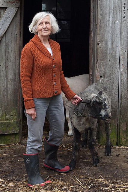
The Twist Collective*?  In addition to the usual smorgasbord of mouth-watering knits, it's the gorgeous older model in the Woolgathering story.  I love it when knitting publications use real people because it gives us a much clearer picture of how the sweater would look on a body much closer to what the average woman has.  And, she makes the younger model with no hips and tiny breasts which seem to hover directly below her ears look plastic.

 Here's the charming lady modeling Rafters by Stephannie Tallent, one of my selections for most-flattering design in the issue.  We love shawl collars and cardigans for the lengthening vertical lines they create.  There's also a strong vertical design element in the cabled panel, but it's a little too far over for me.  The further apart vertical stripes appear, the broader they make the torso look.  They would be much more flattering if they were centered over each breast.  But, that's more work for the designer and knitter since they would have to fade into the angled collar.  I am always willing to do some extra work for a more flattering garment, which explains why I haven't knit a pullover in ten years.

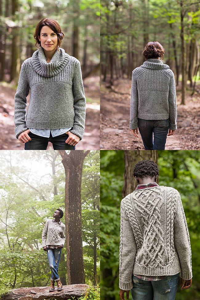
OK, I just said I won't knit a pullover, but I might make an exception for Bevel by Annie Modesitt.  Why?  All the lovely angled lines.  I love a deep v-neck for how it visually breaks up broad shoulders, a wide torso and a big bust.  If she's showing a little too much skin for you, just add a cami underneath.  (Actually, I usually wear a t-shirt under my hand knits so I sweat on the garment which is easiest to clean and most durable.)

The diagonal lines in the patterning created by both the cables and ribbing help to create an hourglass and draw attention to the bust in a flattering way.  The ribbing also causes the sweater to hug the body, and a body will always look slimmer in a garment which echoes its lines.

What I don't love about this sweater is the gauge - worsted!  I really don't like to use a yarn weight above dk because not only does the heavier heavier yarn add visual weight, but it makes a sweater too warm to wear indoors (at least for me).  At least if it were a cardigan, that would help mitigate the warmth of the yarn, but it is not.


Last on my short list of favorites is Charette by Faina Goberstein, and not just because we again have a model with a 'real' body, i.e. busty.  A long cardigan creates a very slimming line, and this one has a deep collar to add visual weight and create a strong shoulder line.  This is a very good design for bodies which carry weight through the hips and thighs.  The only caveat is to be sure to work it to your best length.  It is never flattering for a sweater to end at the same point where you are widest because it creates a strong horizontal which emphasizes the width.  So, either end before it or after - your choice.

Yesterday's mail brought me the fall issue of Interweave Crochet, so I'll review that this week to give a little equal time to the hookers.

* For those of you unfamiliar with the Twist Collective, it's a quarterly on-line knitting magazine.  The e-mag is free, but you pay to download designs which are generally around $7 for a sweater.  A couple hints to provide you with the information you need: 1) if you hold your cursor over the name of the garment, a box will pop up with information on the yarn used, sizing and pricing, and; 2) if you go over to Ravelry and pull up the issue there, you'll be able to see multiple views, usually including the back.

Wednesday, September 4, 2013

Knitting in the News: Vogue's September Issue

The knitting universe has been buzzing about the Chanel ads in the September issue of Vogue.  Why?
Yes, the models are knitting!  And, unlike the rest of us, they seem to be able to float in space while they do it!  (Note to self:  research whether any real astronaut has knit while on a space mission.  Those Russians seem like the industrious type to make practical use of their down time on the space station.)  

 So what do they seem to be knitting?  Did Karl run so horribly late on production of his model garments that he's got them working the few last rows?  Sadly, none of the other black, white and leather garments shown in the ad give us a hint of what the knitters might be making with that brightly colored yarn.  And, it doesn't appear that the other items in the ad, while they are intriguing, are even knit.

The fabulous garment below seems to be made of scrumbled lace.  Perhaps an inspiration for a crochet garment?

Monday, September 2, 2013

Round One: Which Sweater Makes the Model Look Slimmer?

        One of the many things I love about Webs, aka yarn.com, is the photos in their catalogs.  Why?  First, they use models who don't appear to be professional models, i.e. they appear to occasionally enjoy a good meal.  So you are able to get a sense of what a sweater pattern would look like on a real person.  But, even better for me and my educational purposes, you can cut and paste, physically or digitally, and compare how two different designs appear on the same model.  Since I love to do this, and it truly is insightful, I expect that this will be a frequent feature.  And so we begin.


Take a look at the two designs, known henceforth as Purple and Green.  Which one do you think makes the model look thinner?  Why?

To me, it's clear that she looks much slimmer in Green.  It has strong vertical design elements in the lace panel, the ribbed button bands and even the line of buttons to draw the eye up and down and elongate her figure.  The v-neck creates a diagonal line which also elongates.  Green is worked in a much heavier yarn than Purple, which should add visual bulk (and it does), but the strong design elements still make it a winner.  The fact that it was styled with a dark bottom to carry through a color in the same tone also lengthens the model's figure.

Purple is all about the horizontal lines, which draw the eye across the body and, therefore, make it appear wider.  The boat neck creates a strong shoulder line, which the model has balanced by twisting her right shoulder back.  But, the most glaring horizontal is the one at the hip, because of the light-colored top which pops out beneath the sweater.  Even the lengthening line of the locket necklace can't balance out that horizontal line that screams, "LOOK AT MY HIPS".  And we do, because the plain surface of the sweater doesn't provide any interest to distract us.  So, even though Purple is knit in a lighter weight yarn, Green takes the win.

Sunday, September 1, 2013

Woolly-Wits Reviews Knitters #112


_23-k112_nico_78_small2I am going to start my review of the fall issue of Knitter's, aka #112, with my favorite design in this issue (and probably many past issues, too!), Brook Nico's Lush and Lacy Trapeze.  Wow!  I guess you just can't beat mink yarn for drape.  (Yeah, that's right, I said mink yarn.) Shaping in the side panels is what creates all that lovely flowing fabric.  So what do I say about excess fabric?  It will make you look wider.  But, here it is so airy, that I think even those of us who are a little fuller through the hips and thighs might be able to get away with it, if we were a fitted bottom, like the model's jeans.  The very wide ballet neckline creates a very strong shoulder line, which is great for narrow shoulders, or those looking to balance a wider lower body.  But, the arms are quite fitted, so not good for those us us with fat/flabby arms.  So, I've pretty much described a garment ideal for anyone but me.  But, that doesn't mean I am not tempted.  


So, what should I be knitting from this issue?  How about Karen Bradley's Ripple Ridge?  Here's the description? "The ripple stitch glows when worked in a lace pattern with hand-dyed yarn. The triple-ridge welts at the lower body offer waist interest without adding visual bulk. The simple tank shape assures seasons of wear — for true investment dressing."

OK, I totally disagree that the welts don't add visual bulk.  Even in the lousy photo at right, I think you can see far more texture through the hip than the torso.  But, that works for me to balance my wide shoulders and bust.  And, speaking of bust, that's whats not working for me in this design.  I would need to alter the unflattering crew neck to a more open neckline.  I would probably go with a scoop to carry through the scalloped motif.

Unfortunately, I have misplaced my magazine, so I can't tell whether there is actual side shaping through the waist.  If not (and generally with Knitter's there is not), I would add some by either decreasing in the side seams, or, so as not to disrupt the patterning, change needle sizes.

But, I do love the Missoni look that the variegated yarn lends to this design.  Sigh . . . 

_19-k112_cupurdija_74_small2Terri Cuperjia's Cirque Jacket has so many flattering design elements - strong vertical color work, shawl collar, button band - that I should love it.  So, why don't I?  Perhaps I am thrown off my the fact that it is way too big on the model.  See how far the sleeves fall down her hands?  Maybe it's the purple color.  Maybe it's the no make-up, washed out look of the model, But, I think the sweater just looks very dated.  I wouldn't be surprised to see a similar design in my collection of Knitter's from the 80's.

Here's Red & Wine by Theresa Chynoweth.  Ditto to what I just said above.  So many flattering design elements that I should love it.  But, again, it really looks dated.  The proportions seem all wrong - too short, sleeves to wide.  And, the model looks even worse here than in any of the previous photos.  She looks like she has a very bad case of the flu and was dragged out of bed to get a few shots.  Now, I am not make-up crazy person (it's Sunday, so definitely none today), but even models need some.  And, while the editorial staff is doing that, could they please also bring in a hair stylist?  Or did they forget their hot rollers?  For most of my life, I had baby fine, limp hair, so I have all the sympathy in the world for this model.  But, when my image was to be preserved forever in a friend or relative's wedding/anniversary/christening/etc. photos, I got myself to a professional stylist.

Anyhow, I am proving the point I make in the bloopers section of my 'What Not to Knit' presentation:  it is so easy to let the poor styling or fit issues of a photo distract you from what good be very good design elements.  Always go back to the schematic.
_15-k112_kdt_52_small2The last design I want to talk about is the Eggplant Tunic by the Knitter's Design Team.  This brings to mind a trick for the very long waisted among you.  Unfortunately, a slimming long torso is usually accompanied by shorter legs.  So, the trick is to wear a top long enough to go past your crotch.  If you can't see where the torso stops and the legs begin, you will think the legs are longer and the torso shorter.  (Longer legs are always a good thing to visually slim you, even if a shorter torso isn't.)  So consider dropping any long designs a few extra inches to get that effect.

Next up?  The Twist Collective fall issue.